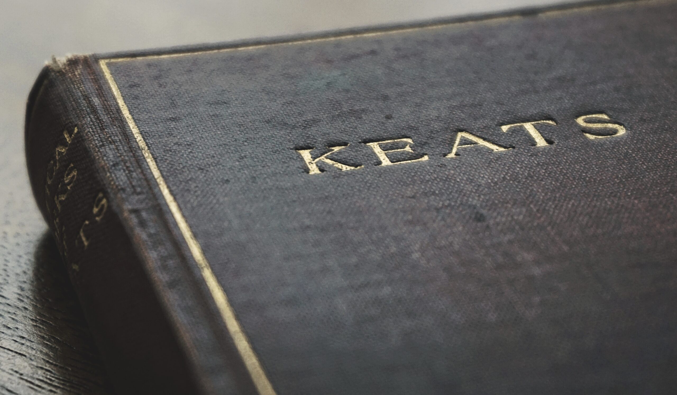
A cog for an eye on A Clockwork Orange, a pair of eyes and red lips above the New York skyline on The Great Gatsby, two orange silhouettes on David Nicholls’ One Day, the half-devil half-man on Brett Easton, and the original Harry Potter all have iconic status when it comes to their book cover.
A good book may not stay with you for a long time, but what will is the cover. There is a somewhat famous saying that relates to never forming an opinion of a story based on the cover that is adorning it. Despite of this fact, lots of readers do get sucked in and judge books solely based on their cover. Everything on a book’s cover, including the colors, the images, and the font give away something about what is inside or even what is not inside. For instance, someone who is looking for a bleak story set in a dystopian future is unlikely to be swayed by a pastel-colored book cover that uses a serif type font.
Book covers send a message
A book cover acts as a good signal as to what the genre is, plus so much more. They provide an insight into the personality of the book. It is the thing that makes a person pick it up in the very first place and then keep it on a bookshelf to act as a reminder of what it meant to them. When a person reads a book, it typically tends to stay with them for a while, both mentally and physically. For instance, it may be in their bag, in their hand, or on their bedside table.
The recent emergence of ebooks however has posed somewhat of a threat to physical books and their sometimes iconic covers. However, publishers have fought back against this by going all out to make physical books even more beautiful to look at and to hold than ever before. The colors have got brighter, the fonts have got bolder and the paper has become more tactile. Bookshops have also become spaces where people now spend a lot of their time – no more do patrons go in and out quickly, they spend time there, even have a coffee or two.
In addition to this, people have taken more to putting photos online of the books that they are reading. You only need to go on Instagram and search for #bookstagram to see just how many posts there are – in excess of 43 million! This goes to show that there is still a place for good book covers, maybe more so now than ever before.
Book cover art
People really do seem to be appreciative of good book covers and this may be one reason why designers seemed to have upped their game to the next level. The best covers are ones that elicit a response in an individual. It may not necessarily be the case that the reader loves the design, but it may be the case that they talk about it with their friends and family etc. What is most important is that the book cover is not plain or bland.
The best book covers convey a message about the story inside of it. If that story is bold and takes risks, the cover of the book needs to reflect that. The best designers should be able to do this with great ease. In order to find book cover designers for hire, follow the link. For instance, the rotting and wet apple and paper on the front of A Girl is A Half-Formed Thing by Eimear McBride seamlessly flows into the reading experience of the book itself.
Creating a book cover that is a true reflection of the story is equally, if not more, important than creating one that is memorable. For instance, it is important that the design of the cover does not lead the reader to think it is a certain type of book when the reading experience is somewhat different to this. This can end up leaving the reader feeling disappointed.
As any book designer will attest to, the pressure to get a book cover right is greater than ever before. There is so much going off in bookstores that a book can easily get lost within it. It can therefore be difficult to make an impact and get people to pick up a book and begin to thumb through it.
However, it is not just in physical bookstores where books need to stand out from the competition. They need to do the same online too, whether that be on webstores or on social media like Instagram. The marketing of books online has actually led to a trend of the covers becoming brighter and with lots of imagery on them.
An example of a more modern styled book cover that was heavily designed for its look online is Everything is Illuminated by Jonathan Safran Foer. This was really good for creating an image of what was inside of the book rather than simply creating an image. The way that this was achieved by the designer ws by them actually reading through the entire manuscript and then using the theme and style of the book to come up with the cover for it. However, sometimes the inspiration comes directly from the author who has a very clear idea of how they want the cover to look.
What happens when it goes wrong?
Even in those cases where the book cover is not great and is unpopular with readers, these problems can sometimes be overcome. For instance, the cover of Neapolitan novels by Elena Ferrante looked very much like a Hallmark card but still managed to sell a huge number of copies and was critically acclaimed by those within the industry. Agatha Christie famously hated the cover to her book Sad Cypress but that did not stop it from being a literary success and selling many copies.

